Well, they still do.
The latest abomination was foisted upon the unsuspecting public this previous weekend. They shipped out with Sunday’s paper an insert… Their college football preview piece. Needless to say, this city is pretty jacked up about the rapidly approaching Boise State game vs the vaunted Ducks of Oregon down on the Blue. Obviously, there has been a lot of hype for this game during this past 8 months. Appropriately, they titled their guide “Hype”.
Now, I’m not critiqueing their content. It was good enough apart from some exceptionally lame “overrated” pieces on each page, (really? Bashing Twitter is not fresh) but I digress. No, I have a problem… wait, check that… I have NUMEROUS problems with the image they created for their cover.
For the record, I am NOT a designer. I think I have a marginal eye for design, but the designers I work with make me realize I have exactly ZERO skill compared to them. Wirestone has some of the best designers I have ever seen in their employ. Obviously, the Statesman does not.
Warning, the following image is so horrible, it could scar you for life.
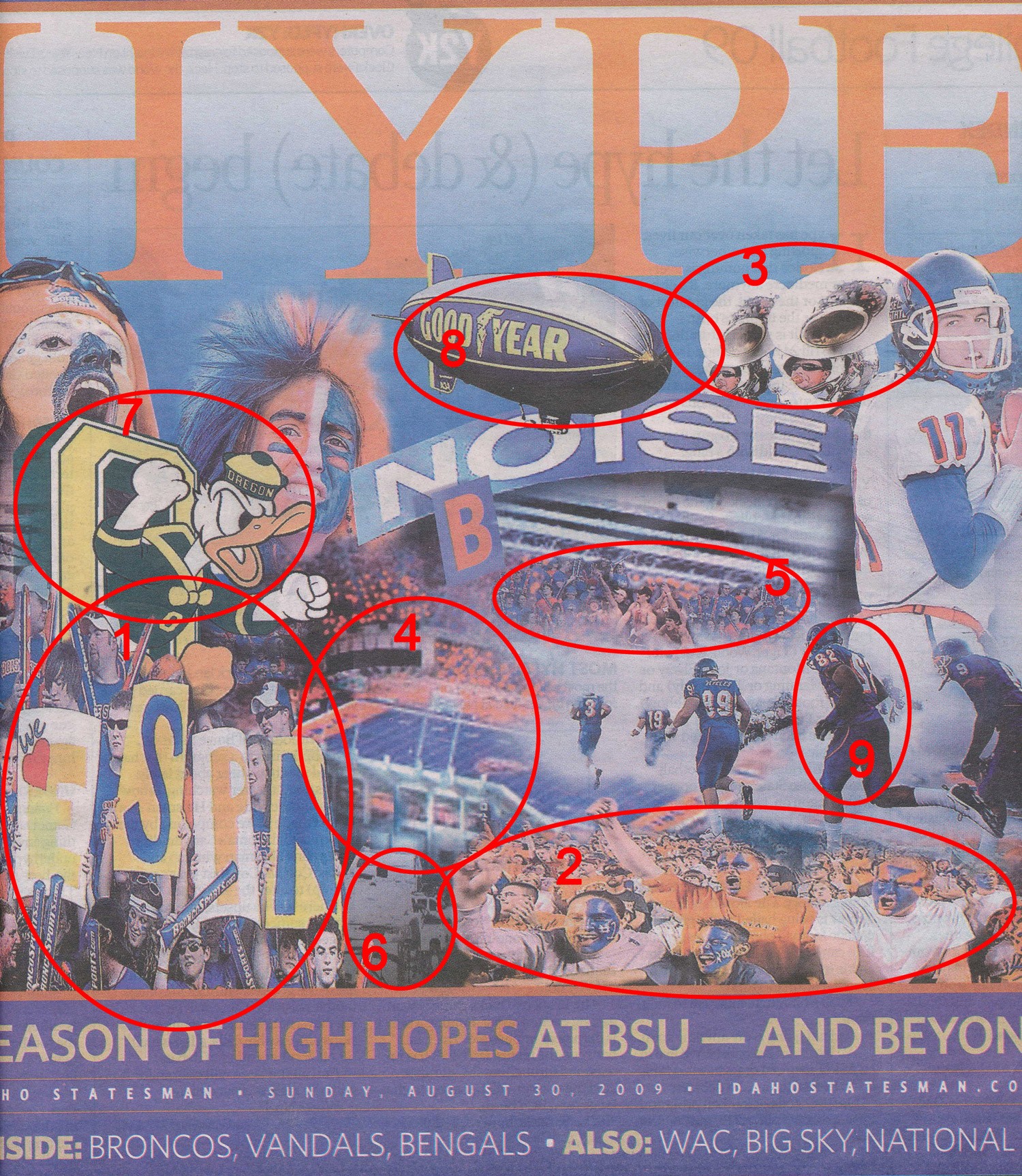
(click the image to grab a larger, closer view of this steaming pile)
Let’s break this down:
Numbers 1, 2 & 3:  Look at those images… apparently the person who put this together doesn’t have a clue about “aspect ratio”. You know, when an image is either squished (#1) or stretched (2&3) to the point it just looks really really bad? Yeah, that’s what they did. I could almost forgive #1, if it was the only one on the page. A stylistic choice, one could say. However, when you have a couple others on there, that “style” goes right out the window. Really, all you have to do is use the images in their correct aspect ratio, make them larger or smaller, or re-arrange your collage. Seriously, that is extraordinarily rudimentary.
Number 4:  So they use a shot of the stadium as their “background”. Ok, I get that. Unfortunately, that image they used is completely out of focus. It is blurry and looks like crap. If I were to hazard a guess, the same meathead who stretched those first images, also used an image that was too small to fit in the space. “Well, no matter, I can just re-size it in Photoshop and make it bigger!” Not so fast there, Cochise. What happens when we enlarge something too big? That’s right, the whole image looks fuzzy, out of focus and generally like crap. Yeah, let’s put that in the very middle.
Number 5:  Random shot of the crowd, hovering over the grandstands in the background. What the hell is this? It doesn’t make any sense, visually. I honestly don’t understand why they are trying to do here. Those fans don’t match anything else in the picture, they are just floating there, but you can still see the Stueckle Sky Box from the blurry background pic behind them. Totally bizarre.
Number 6:   I don’t even know what the hell that is supposed to be. Why they decided to stick some black and white photo of something completely indistinguishable (which may or may not also have some aspect ratio problems as well) in there I will never know.
Number 7:   Yes, we are playing Oregon. However, this logo stopped being their “official” logo in 1993. You mean to tell me we couldn’t use something more current for them? Why not?
Number 8:
Photoshop guy:Â Here is my “hype” image, sir.
Manager:  It’s good, but it doesn’t convey “big” enough. What do they do for the Super Bowl… I know, blimps!
Photoshop guy:Â But… sir, the Goodyear Blimp has never been to a BSU game, and I’m pretty sure they won’t be there on Thursday…
Manager:Â No matter, just slap in a picture of the blimp at the top… people will get it.
Photoshop guy:Â Can do!
And, just make sure that its perspective doesn’t match anything else in the image as well… He forgot to mention that one.
Number 9:  Take a good look at that. Notice anything off? No? Look closer. Specifically, look at the number on Julian Hawkins’ (82) back. Whoops… someone forgot to flip that number when they flipped the shoulder number. I also suspect there is some problems with #99 Reveles as well, but whatever. I won’t even get into why those giant players are running in a cloud to a tiny field. I’ve long since stopped trying to figure out the logic of this.
There ya go. When I first glanced at it, I was annoyed but couldn’t figure out why. Once I sat down and really looked at it, I realized just how bad this was. I would expect something like this from a junior high student just figuring out how to slap images together in Photoshop. Not something a professional organization would produce.
The thing is, I know the Statesman has talented people (Brian Murphy aside). They have some of the best photography I have ever seen.  Their collection of Boise State photography has got to be massive. Yet with all those resourses, THIS is what they come up with?
Seriously… you’re a metropolitan newspaper. You have to do better than this.
Whew, I feel better now.
Yep, you needed to do that. I was not impressed by the front page or much of what was inside either. Small town newspaper, they have laid off all the good people.